Dutch designer Christian Boer, a graduate of Utrecht Art Academy, has stepped up and created a dyslexic-friendly typeface to make reading easier for dyslexics like himself.
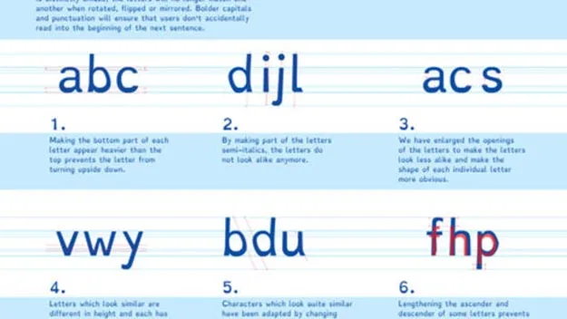
Called Dyslexie the font, originally created as part of Boer’s 2008 university thesis, looks a lot like typical lettering, but is customised so that the variation between each character is more distinct so dyslexics can recognise the difference between symbols easily.
“Traditional fonts are designed solely from an aesthetic point of view,” Boer writes on his website, “which means they often have characteristics that make characters difficult to recognise for people with dyslexia.
“Oftentimes, the letters of a word are confused, turned around or jumbled up because they look too similar,” he adds.

PHOTO: Dyslexie Font website.
The fonts heavy base lines, alternating stick and tail lengths, wider openings, and semicursive slants ensure that each character has a unique and more decipherable look.
On his website Boer, who is currently showing his font creation as part of the Istanbul Design Biennial, said that independent studies conducted by the University of Twente and the University of Amsterdam confirmed that the font helps dyslexics to read faster and with fewer errors.
According to the Dyslexie website the font, which is available for free download, is being used within companies such as Shell, KLM, Citibank, Pixar, Nintendo, Talpa, as well being the go to typeface for children’s e-books.
Dyslexie isn’t the only font designed for dyslexics. Others include OpenDyslexic, a type face introduced in 2011 that is also available for free download.


